
The former PTT or Swisscom skyscraper in the east of Bern is the tallest modern building on the city of Berner Boden. Built around 1970 and vacant since 2017.
The plan is to convert it to a mix of residential apartments, offices and shops.
The Problem:
Low response rate (in filling survey needed by the developers of the project)
Users complaining about the complicated process of filling out the survey and overall understanding of the offerings (example: Buy or rent, Views, residence type, amenities etc) Due to vertical continuous scrolling, disorientation and cognitive overload.
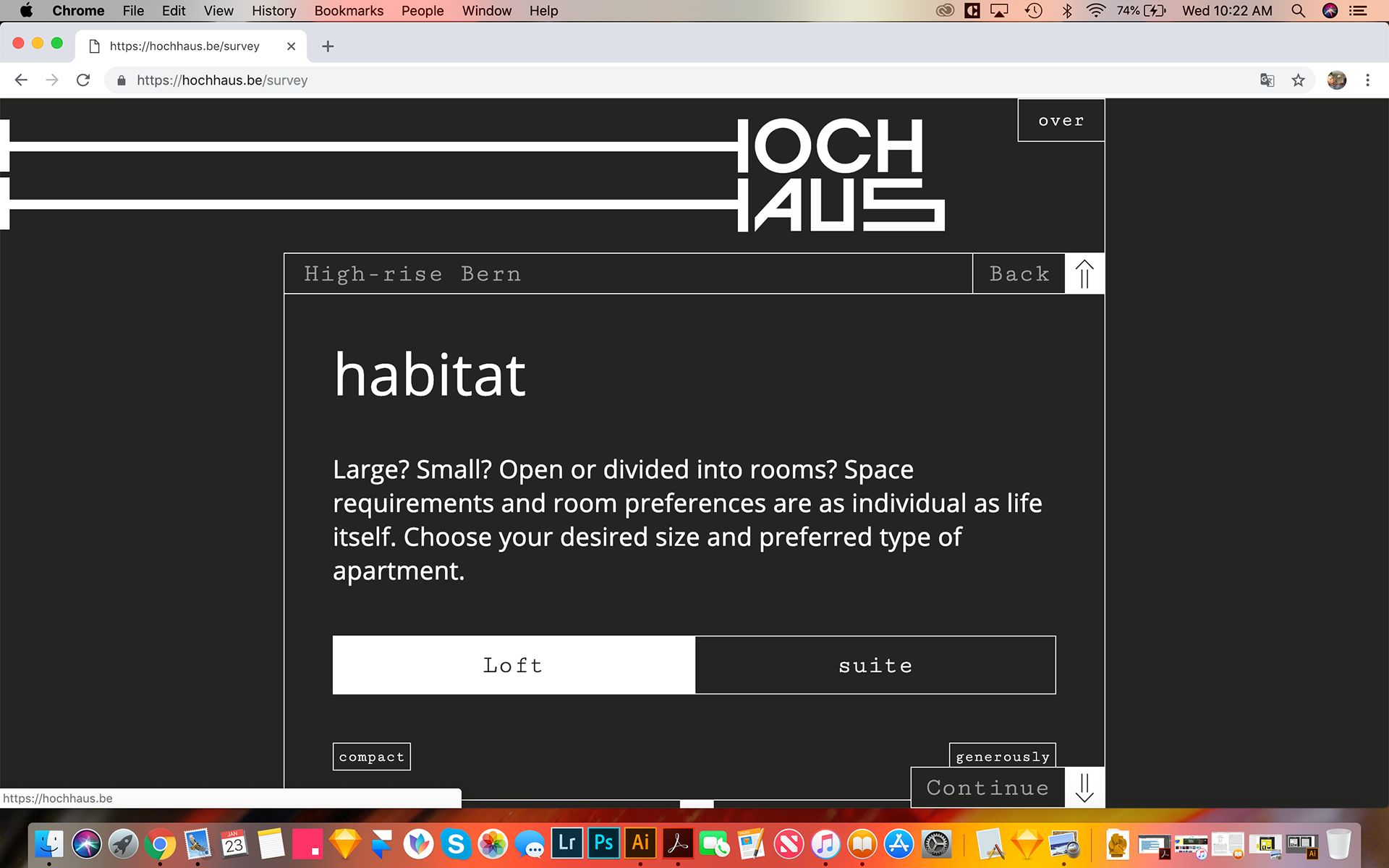
Current Site: A lot of scrolling and not cleat path to the User.
Suggested Solution /Low fidelity Sketches following...

-In this low fidelity wireframe/sketch, it is suggested that the User finds everything about the development and the survey all in the main landing page and above the fold. This way it will be less steps for people who don't want to go through the survey or people who already did and just want to check out contact info or look through images of the development for example.
-The Introduction of tabs showing the user what is expected of them clearly from the beginning is always more effective than having them scroll through a site without a clear roadmap.
-Having things highlighted visually when clicked or tapped on gives the Users the assurance that it's working as intended and makes them continue smoothly.
-Having the Survey In the centre and in a different color gives it weight and makes the Users easily complete the actual task at hand (potentially choosing their own dream apartment).